brand story

chrrybmb pairs crisp UI with iridescent motion—retro 8-bit energy meets prism fractals. The system stays mini and intentional: compact spacing, pixel cues, and modern type with a nostalgic glow.
how it started
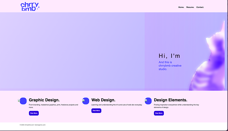
Early homepage scaffold: rough blocks, first layout pass, tokens coming online
first pass: grid, nav, and token groundwork. the glow is a whisper—structure first.
how it went
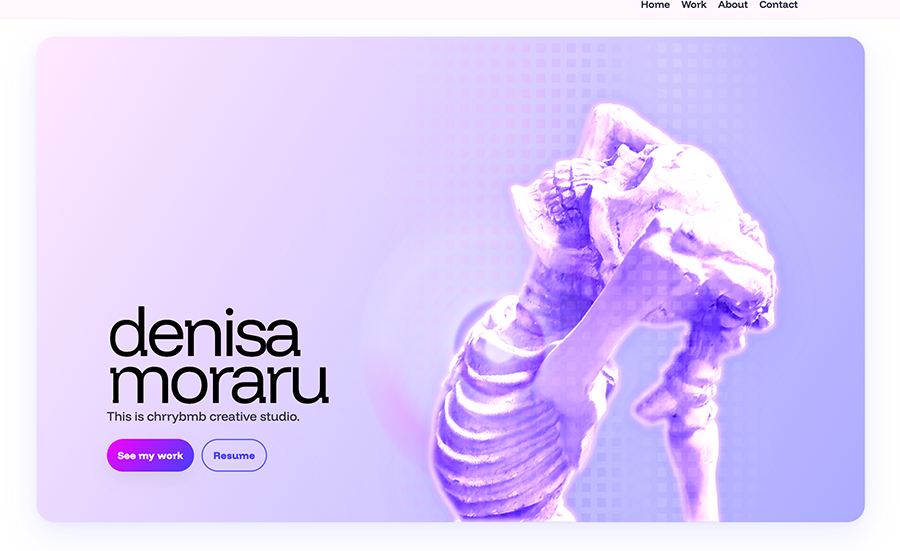
Later homepage build: stronger hierarchy, refined spacing, prism glow in place
hierarchy snaps in, spacing breathes, and the prism comes alive. mini by design—high signal, low noise.

hero imagery inspo

before
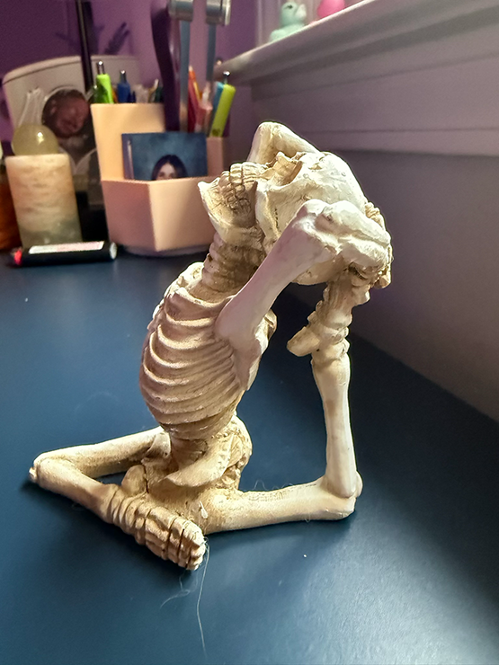
skeleton in eka pada rajakapotasana — the seed image behind the chrrybmb hero
side-door muse → homepage icon. eka pada rajakapotasana, heart up to the sky— aligned with her higher self. raw, joyful, a little punk. the edit turned that spark into the site’s prism glow.

typography · funnel display

Aa
Display · 700/800 · Tight/–0.02
ABCDEFGHIJKLMNOPQRSTUVWXYZ
abcdefghijklmnopqrstuvwxyz
0123456789 !?&*@#
Hierarchy (mini)
H1 — Prism headline
H2 — Section title
H3 — Card title

typography · jacquarda (accent)

the world is an iridescent prism

A lyrical counterweight to Funnel Display—used for kickers and asides. It also carries a subtle classic arcade vibe that resonated with me and stays true to the brand’s pixel energy across the site.

Specimen
A B C D E F G H I J K L M · a b c d e f g h i j k l m · 0 1 2 3 4 5

color system

Core swatches (tap to copy)

indigo #4440FF
pink #FFE9FF
iridescence conic/radial blend

components · buttons

Pixel-mini, uppercase Funnel Display. Primary + ghost.

PRIMARY GHOST